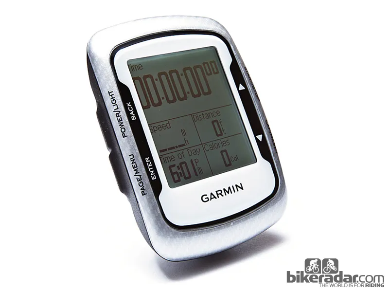
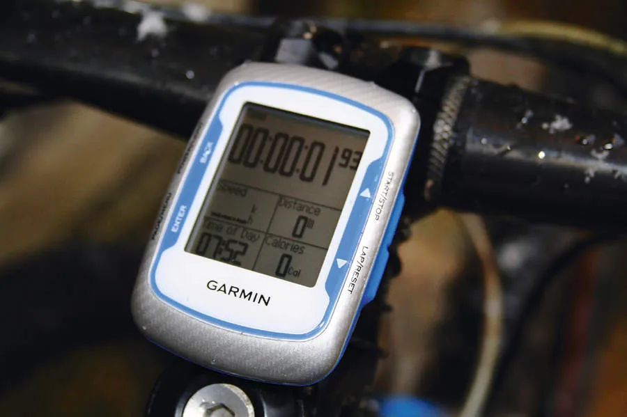
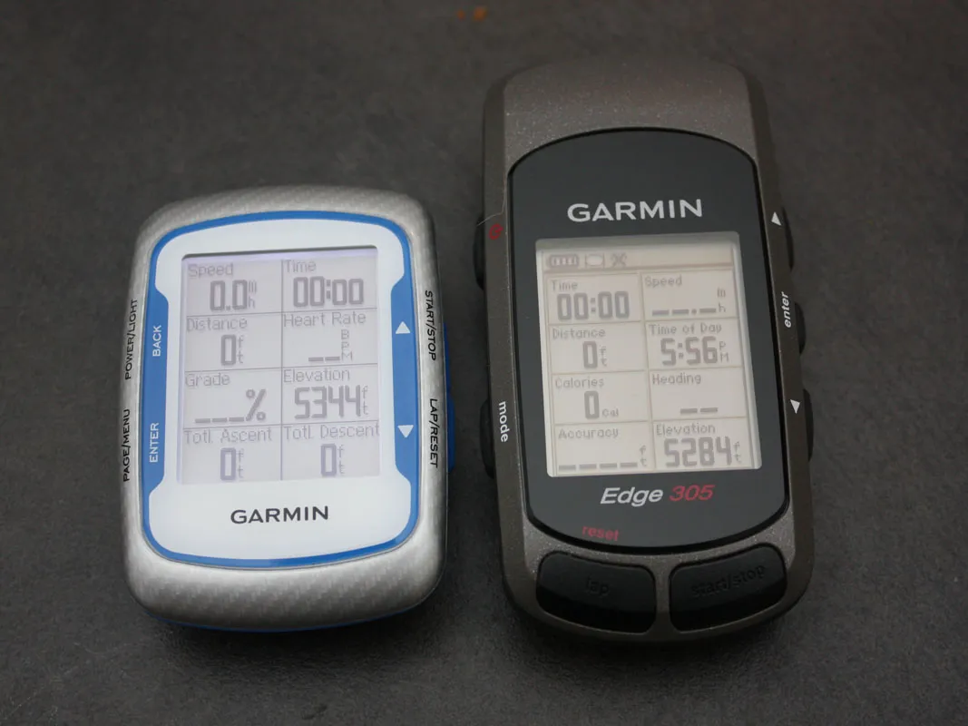
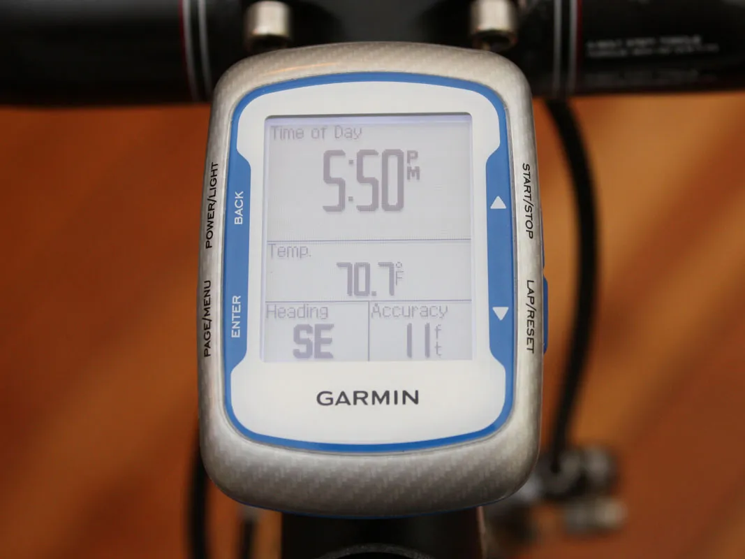
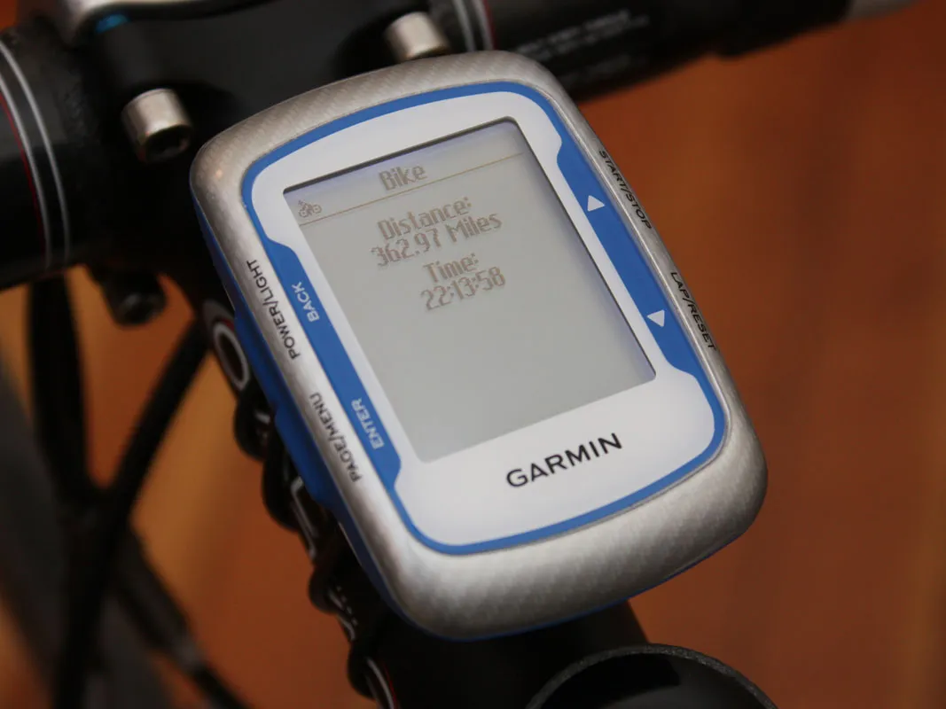
Garmin's new Edge 500 computer is a significant improvement over their long-standing - and still excellent - Edge 305. It's not only lighter and smaller (65g including mount, 48x69x22mm), but also manages to offer a bigger and more legible display, plus more functions.
Editor's note, August 2019: The Edge 500 is now discontinued and only available on the second-hand market. Why not check out our review of the feature-packed Garmin Edge 530 and our guide to the best GPS computers for bikes?
Like with the Edge 305 there are no wires to run, magnets to attach or wheel sizes to enter because it uses Global Positioning System satellite technology to feed you data – basically just strap it on and go. In addition to ambient temperature (finally!), the most substantial addition is power output, available if you link up the Edge 500 to any number of power meters on the market via the onboard ANT+ wireless antenna.
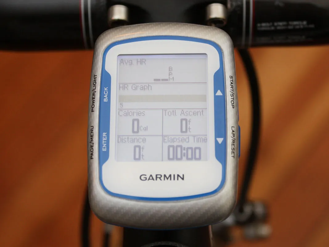
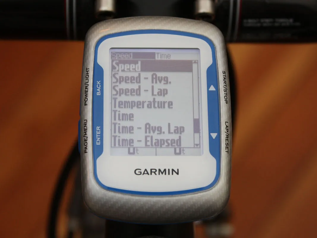
Add on the optional wireless heart rate and combined speed/cadence sensor (£250) and you're pretty much got all of the information bases covered aside from full web access. As before, that data is displayed in up to eight customisable fields per 'page' but now there are a full 41 options to choose from and three instead of two pages on which to spread them out.
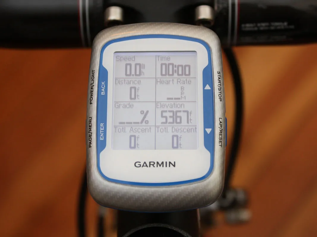
Use one to display critical pieces of information like the usual speed, distance and time variants, another to review post-ride data such as vertical ascent and average heart rate, and the third to summarise power data such as average, three- or 30-second average and maximum output – or whatever combination you deem most suitable. The point is that you can display as much or as little data as you prefer and organise it based on your personal wants and needs.
The only major casualty in the upgrade in terms of data is the Edge 305's on-board mapping functionality. While the 500 is still connected to orbiting satellites, it won't show you where you've been or let you mark key locations during your ride. Your route shows up when you upload the information post-ride to databases like Garmin Connect though, so the Edge 500 is still more than just a glorified speedometer. Curiously, other handy bits of info like maximum speed and sunset time have disappeared as well – maybe they'll be added with a future firmware update.
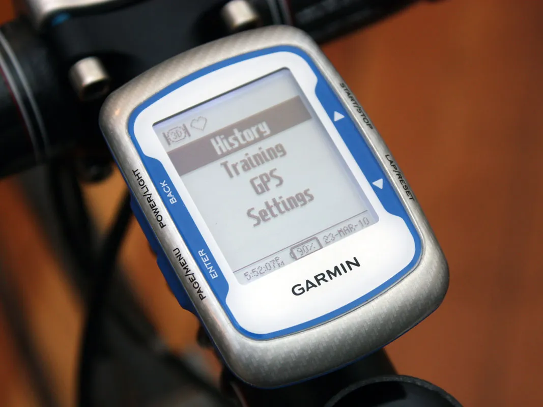
Overall usability of the Edge 500 is substantially improved over the 305. The menus and operations are laid out in a more intuitive fashion, the GPS receiver locks on to satellite signals far quicker than before, and run time on the internal rechargeable li-ion battery has increased a whopping 50 percent (up to 18 hours under ideal conditions – we got closer to 16). A graduated meter provides a better measure of remaining battery and charge time than the 205/305's vague 'battery charging in progress' message, too. You occasionally lose the GPS satellite signal – if you’re going through a wooded area or highly built up area, for example – but that really is rare.
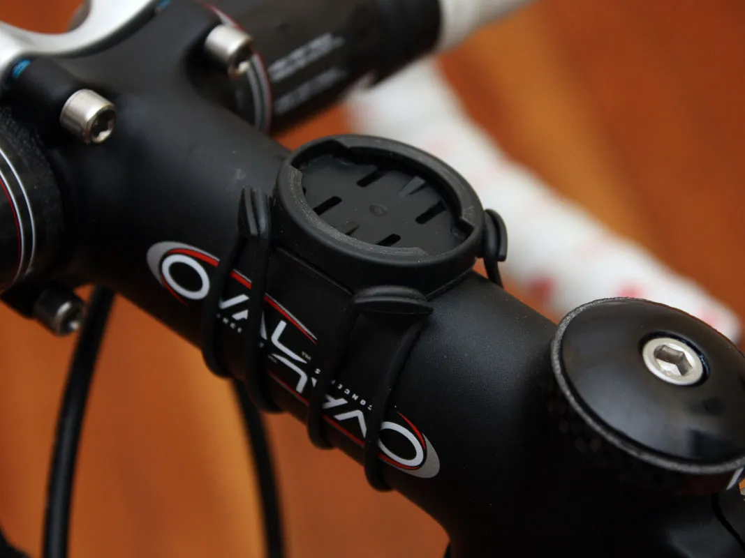
There are still a few things we'd change, however. Garmin have abandoned the sliding attachment style of the Edge 205/305/605/705 mount in favour of a simplified 90-degree twist motion. True, the new mount is a bit easier to operate, less likely to break and the reusable O-ring straps don't require new zip-ties every time you move the unit to a new bike (two mounts are included) but current Edge owners who decide to 'upgrade' won't be able to use their own ones.
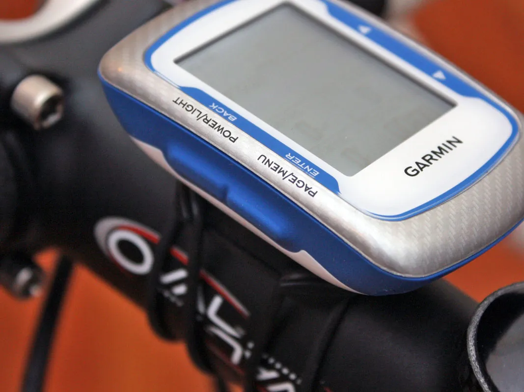
More critically, the foundation isn't as rock-solid as it was before and there's definitely more wiggling when you depress the buttons. Speaking of buttons, we also wish Garmin had moved away from the side-mounted locations to top-mounted ones. The side-mounted ones are still waterproof but top-mounted ones are much easier to operate on the bike (and they'd also negate the downsides of the new mounting style).
Ergonomic niggles aside, the new Edge 500 is an easy choice if you don't need the mapping functions of the 205 or 305. It's smaller, lighter, more powerful and easier to use and read, plus it's even the same price, too. Now that Garmin have added more colour options, you're no longer even stuck with the blue-and-grey scheme. We can't help but wonder, though: as the Edge 500 contains all the same basic hardware and collects the same data – and then some – as the Edge 305, why weren't Garmin able to still include the mapping functions?
