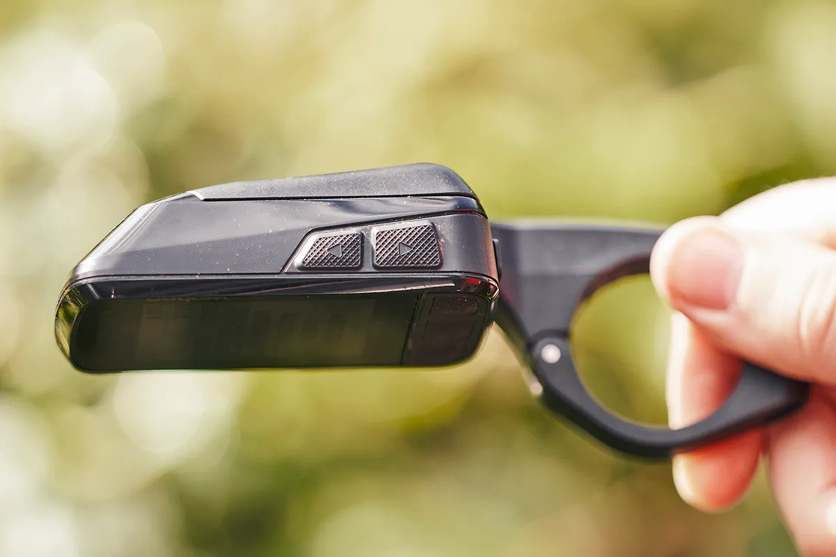
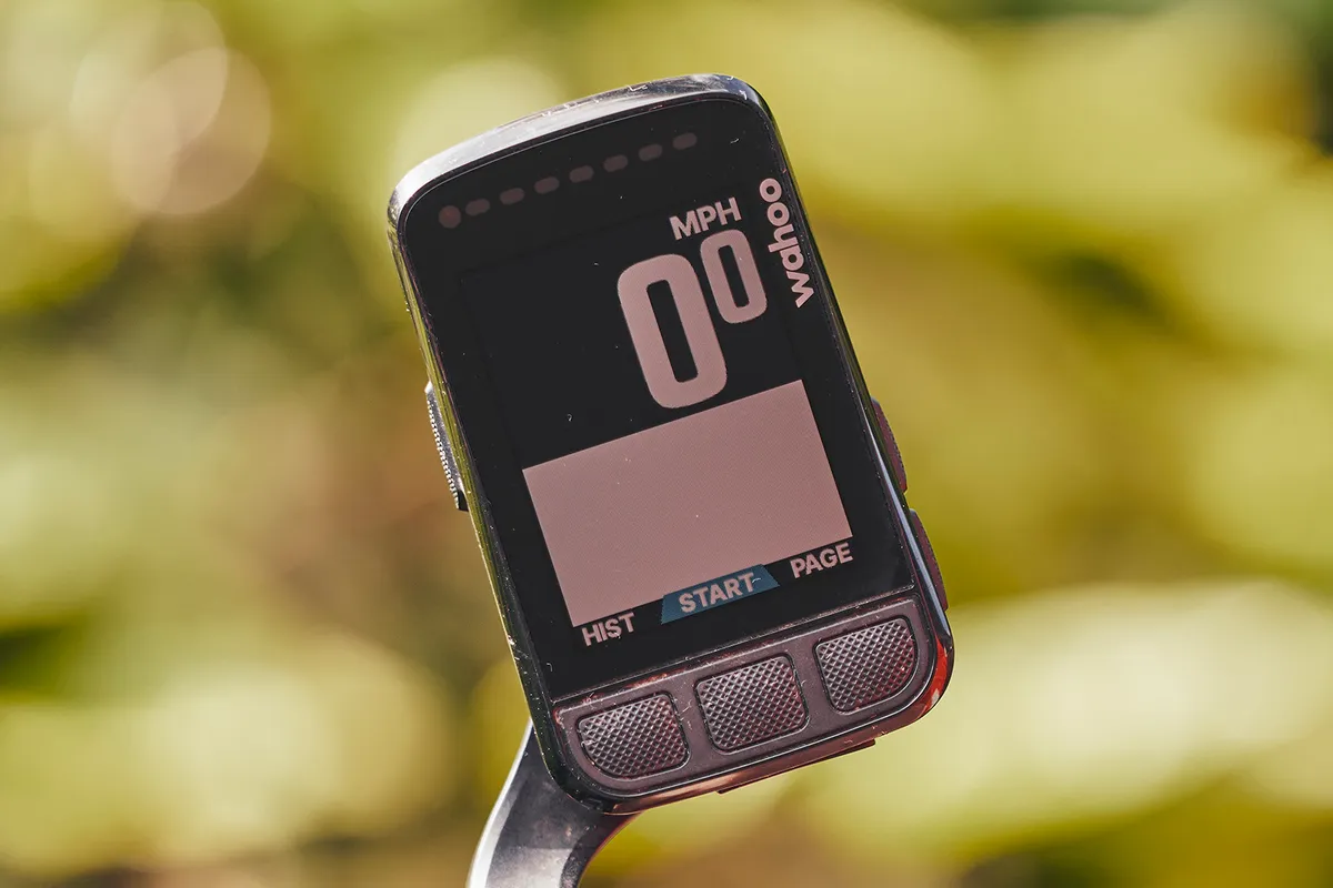
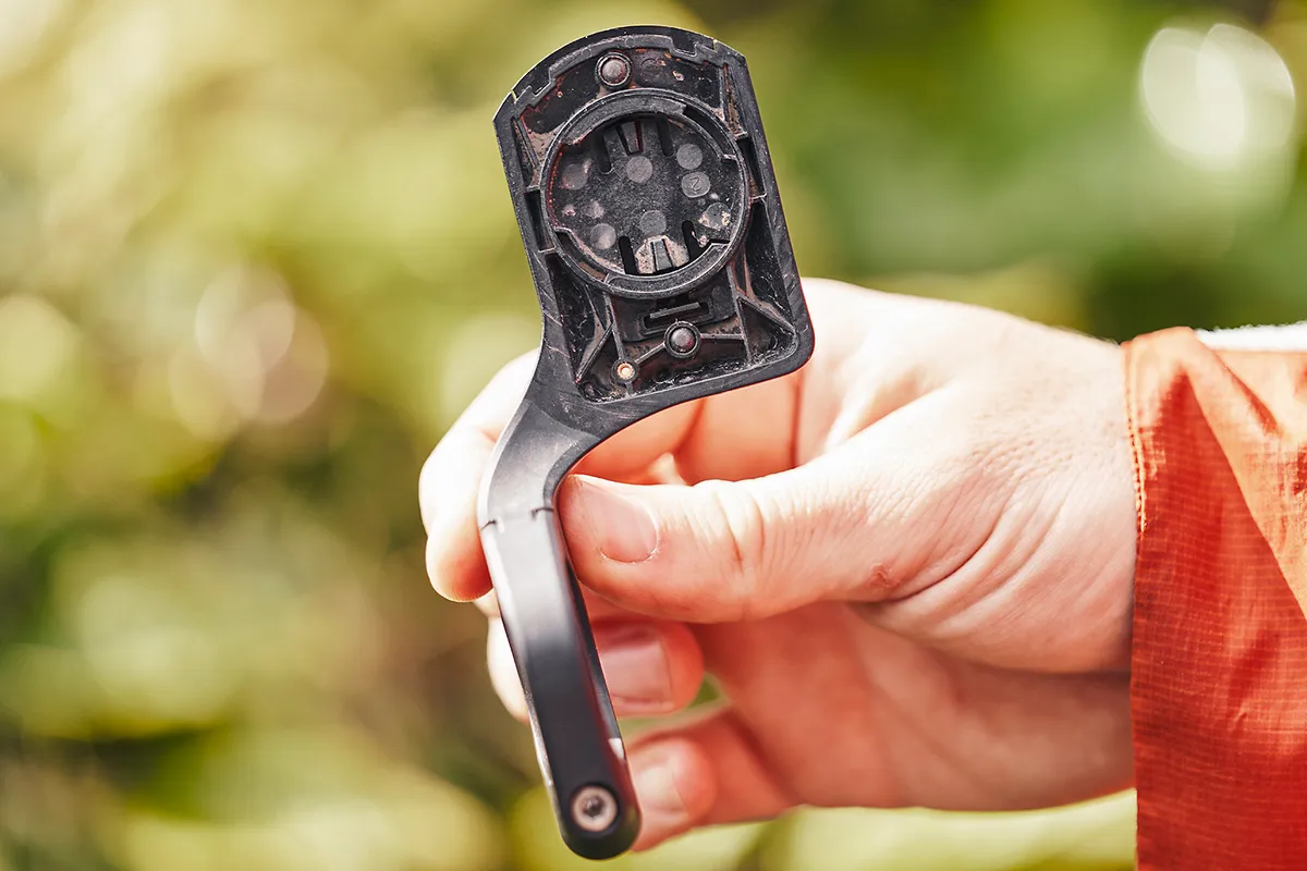
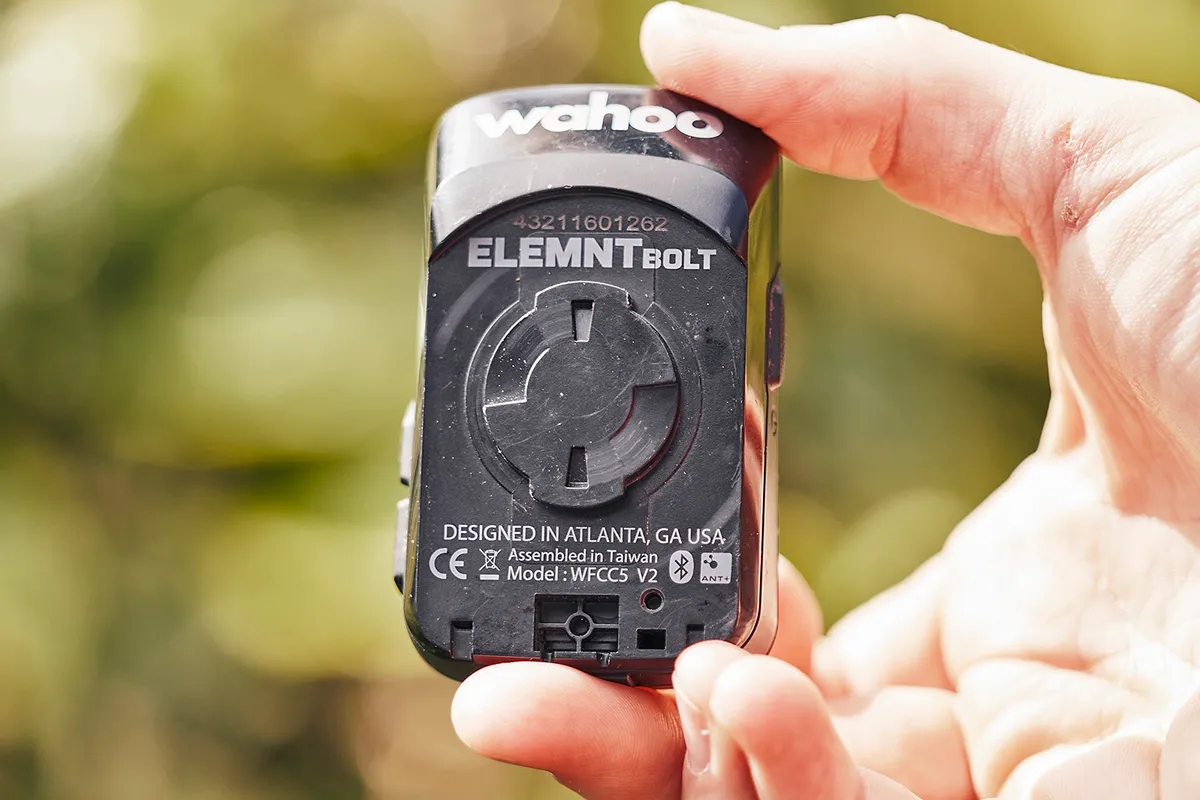
Wahoo’s second-generation Elemnt Bolt is an excellent bike computer that covers off the key features most cyclists will need in a compact package.
It offers a colour screen, smart navigation, USB-C charging and improved battery life over the original Wahoo Elemnt Bolt, in what is otherwise ostensibly the same aero-profiled package as its predecessor.
The aerodynamic profile of your bike computer is unlikely to make the difference between winning and losing the group sprint to your local cafe, but it signals Wahoo's intent for the Bolt as a data-focused piece of kit.
This is a unit that balances the mapping and data needs of performance-minded cyclists – and it largely succeeds, though there are better options for detailed navigation.
Wahoo Elemnt Bolt V2 setup
The Bolt is controlled by six buttons – there’s no touchscreen – but all setup and data screen customisation happens through the Elemnt companion app.
Simple setup has always been one of the key advantages of Wahoo’s computers and that continues to be the case here. Power up the computer, scan the QR code with your smartphone and voila, everything unfolds in a series of intuitive steps from there.
Customising data screens through the app is a breeze, too. Just select the screens (e.g. ride data, navigation/mapping, Strava Live Segments) and data fields you want to see, and it’s instantly reflected on the computer.
If you want to add (or remove) any fields while riding, you have to get your phone out to make those changes. However, the simplicity of using Wahoo’s companion app beats endlessly scrolling through data options on the device itself.
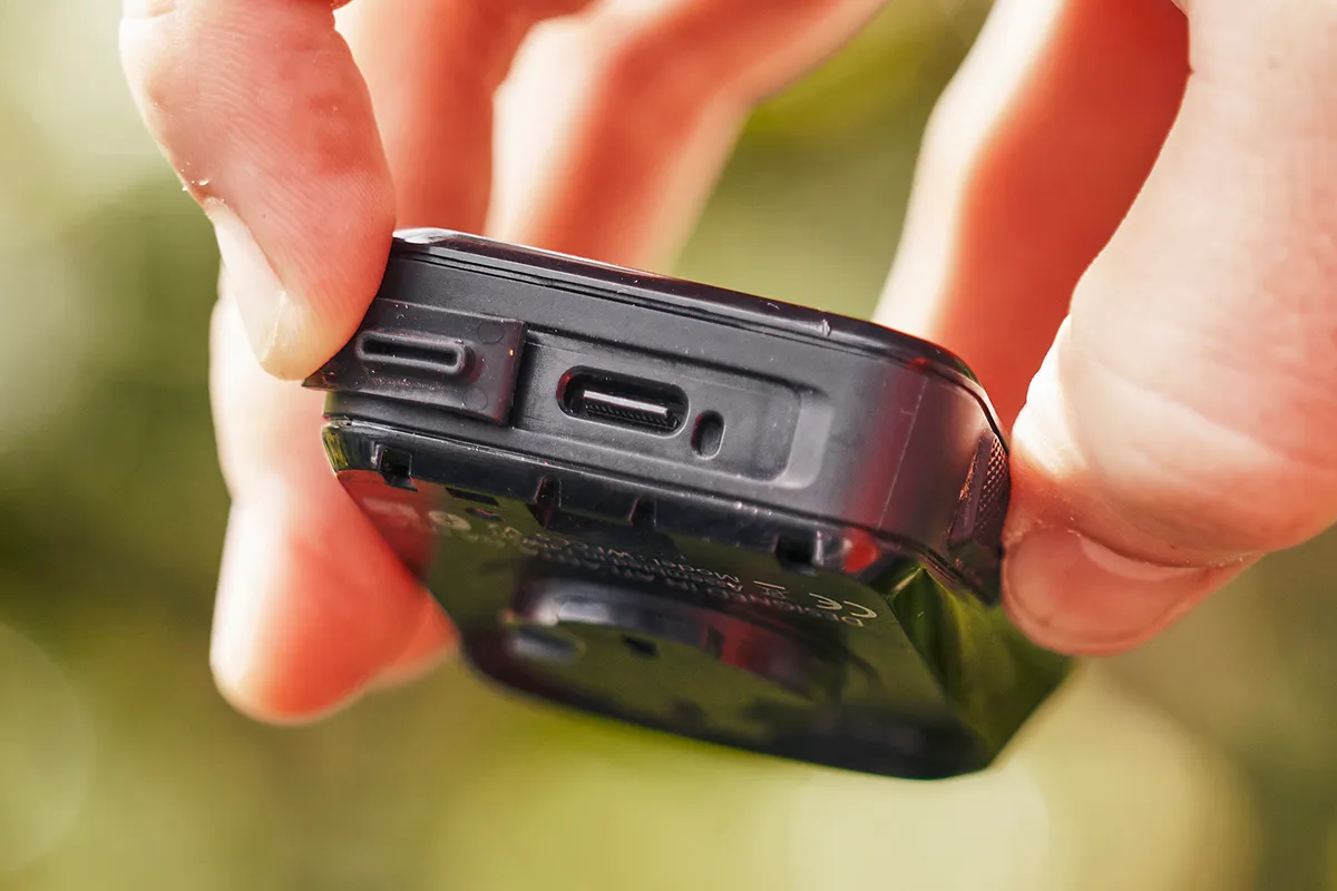
Wahoo claims 15 hours of runtime and my testing suggests that’s about right, while the USB-C charging keeps things up-to-date, too.
Wahoo Element Bolt V2 data
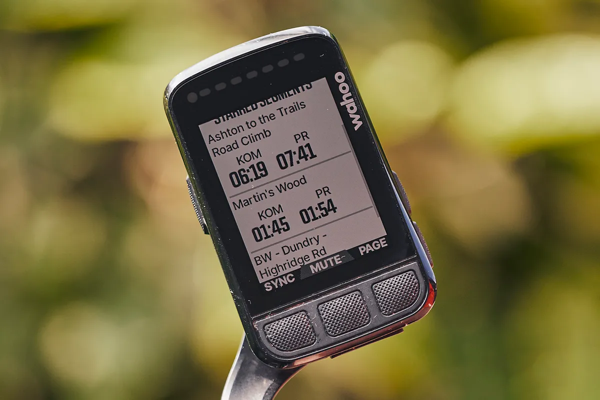
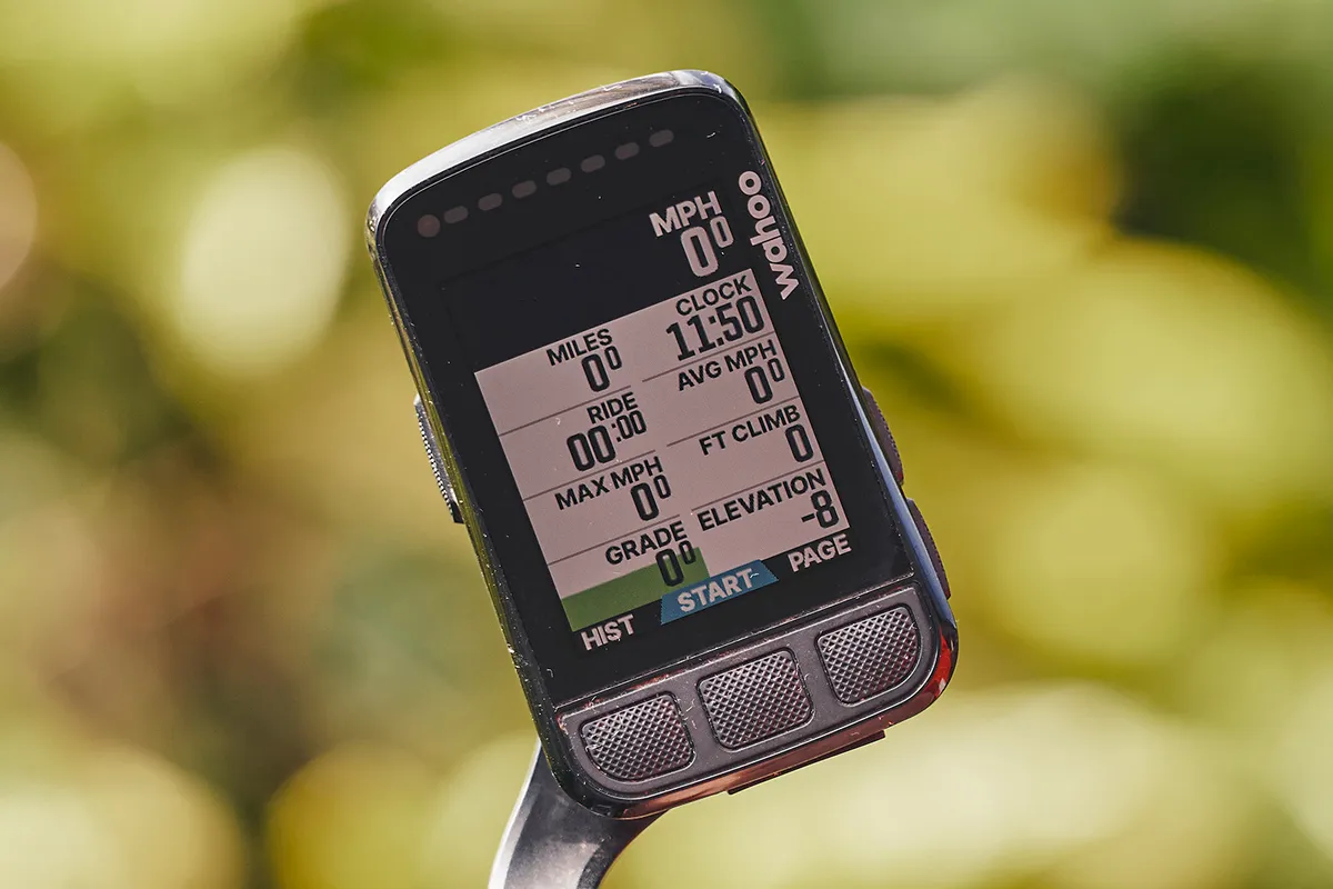
In terms of data capabilities, the Wahoo Elemnt Bolt V2 has pretty much everything you’ll ever need.
There are no fewer than 20 categories to choose from when selecting data fields to populate a custom page on the device, from the basics, such as distance and climbing, to muscle oxygen metrics and 90 (yes, 90) data options for power.
You can also display your phone’s battery life, gear selection (assuming you’re using an electronic groupset) and tyre pressure (if you’re using a Quarq TyreWiz). You get the picture – the data options are vast.
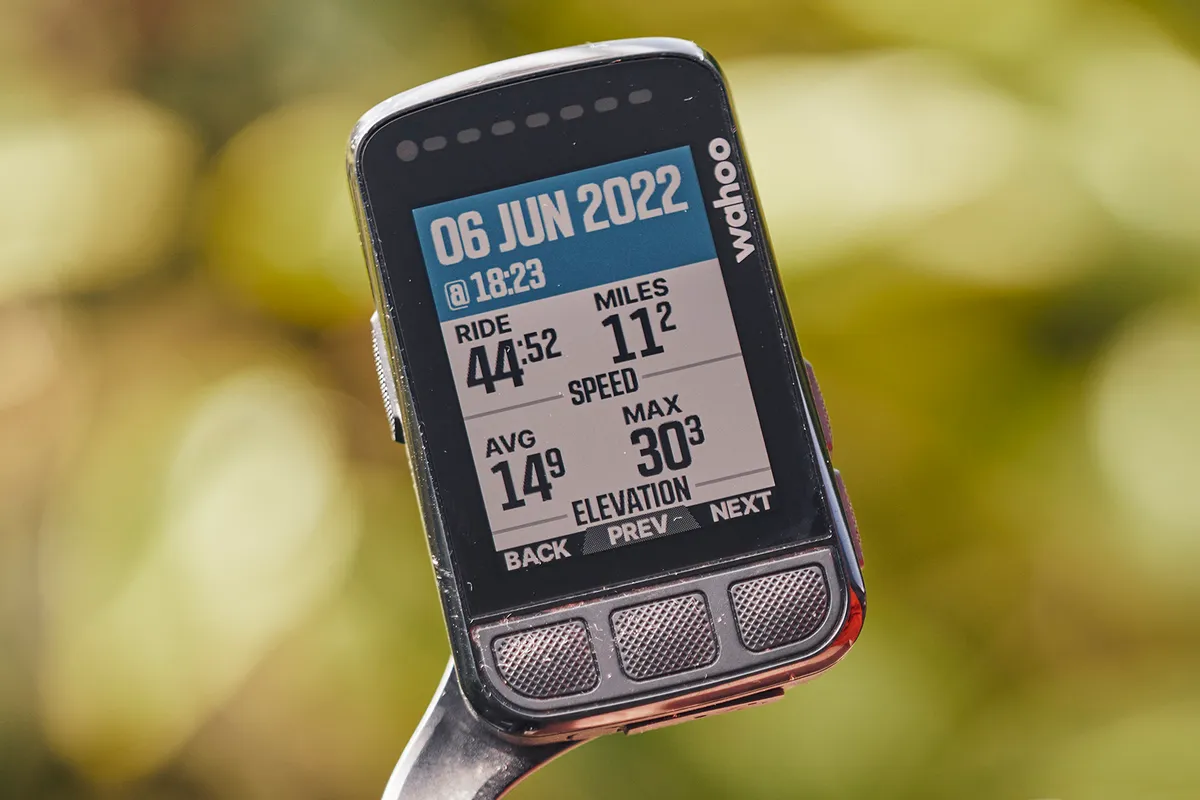
The Bolt has a horizontal strip of LEDs across the top of the computer and these can be used to display additional ‘information’ while riding, whether that’s flashing after a wrong turn or by showing your relative effort against heart rate or power.
You can also use colour-coding to show how hard you’re working on the screen itself (within a data field). On that note, uploading pre-defined workouts to the Bolt is simple via the Wahoo companion app.
There are the usual integrations with third-party apps – Strava, TrainingPeaks and Komoot, for example – to download maps and upload data, along with live tracking, call and text notifications (with the option to turn on ‘do not disturb’), and so on.
You can connect the Bolt to sensors (power meters, heart rate meters and so on) via the app or device itself. Everything just works as it should.
Wahoo Elemnt Bolt V2 navigation
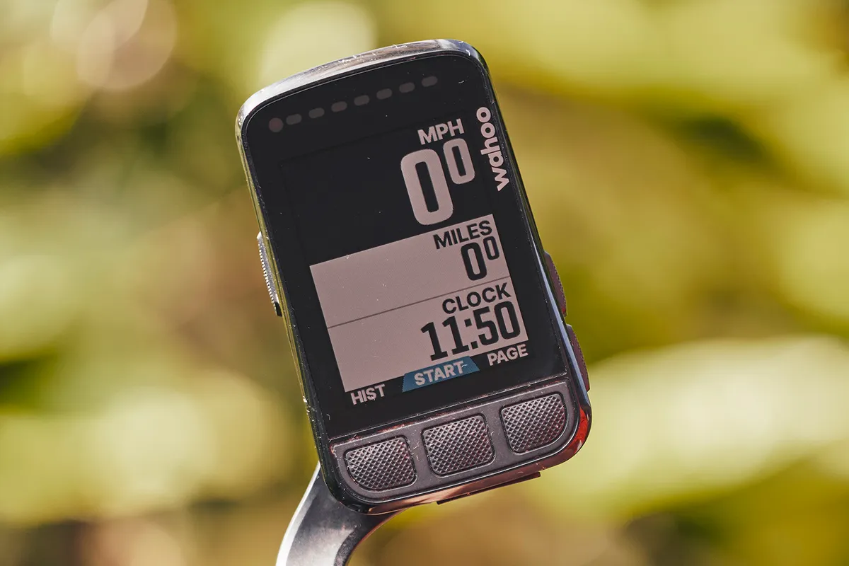
The Bolt’s 2.2in colour screen is a marked step up from its predecessor.
Wahoo has used colour relatively sparingly, but to good effect by improving clarity where it matters. That includes road designations – main roads are orange, secondary roads are yellow, minor roads are grey and cycle paths are blue – and the heart rate zone you’re in during threshold intervals.
The colour screen is most useful when navigating – and, if you’re thinking about upgrading from the first-generation computer, a significant step up.
As with workouts, syncing pre-defined routes to the Bolt is simple via the companion app. I’ve used Komoot and Strava during testing.
Within the Wahoo app, you can also create a route by searching on a map, delving into your ride history or retracing your current ride.
So far, so good, but the new Bolt’s usefulness as an on-the-fly navigation aid, if your phone is tucked away in your pocket, is somewhat limited by the screen size.
The 2.2in display has a large bezel and, while the screen is excellent for following pre-loaded routes, you’re better off with a bigger computer more focused on mapping if you want to navigate as you ride, without relying on routes created at home or via the app.
For example, scrolling across the mapping screen using the Bolt’s buttons to manually find a ‘Take me to…’ destination is a fairly cumbersome and time-consuming experience, even if it’s easy via the app.
As for the Bolt’s ‘smart navigation’, this is one of the V2 computer’s new features and will reroute you if you stray off track when following a route.
Take a wrong turn and the unit’s LEDs flash, you’ll hear the tell-tale ‘bleep’ and, within a few seconds, the Bolt will send you back on track.
Wahoo Elemnt Bolt V2 bottom line
All things considered, the Wahoo Elemnt Bolt balances the demands of ride data, navigation and usability in a sleek, sensibly sized package.
However, there are better options with bigger, more detailed screens – with an accompanying hike in price – for riders who want to hone in on mapping capabilities.
Product
| Brand | wahoo |
| Price | 430.00 AUD,300.00 EUR,265.00 GBP,300.00 USD |
Features
| br_stravaLiveSegments | yes |
| br_rechargeableBattery | yes |
| br_screenType | colour |
| br_dimensions | 2.2in / 55.9mm |
| br_screenDimensions | 320 x 240 |
| br_displayResolution | 320x240 |
