Garmin's Touring bike computers have been winning favour with anyone who wants easy navigation and round-trip routing, whether you ride on-road or off. Now sitting top of the tree is the Garmin Edge Explore 1000, which adds smartphone notifications, limited ANT+ support, and incident detection for telling loved ones if you've had a crash.
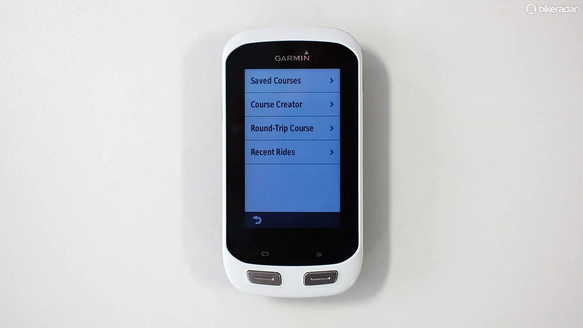
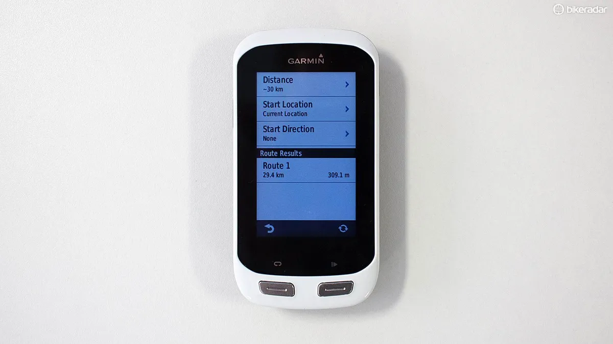
If you're able to get lost in an igloo (guilty) but also want to monitor heart rate and power data, this could be the Garmin for you. I’ve been riding it for the last couple of months on a wide range of routes, and have found it delivers on many of its promises. I particularly like the ‘Create a route’ feature, where you can specify the distance you want to cover and it’ll serve up three different rider-friendly options.
- Garmin Edge bike computers: buyer's guide to all the models
- Garmin Edge 1000 review
- Garmin Edge 820 review
Garmin Edge Explore 1000 appearance
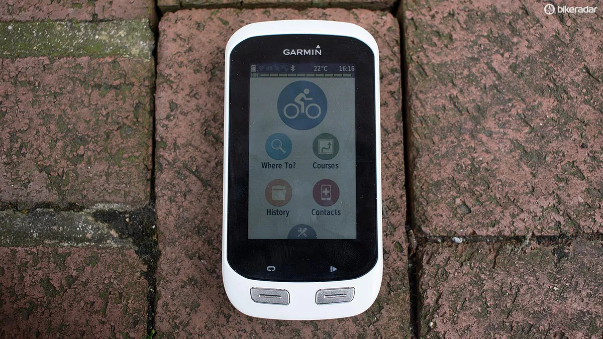
No getting away from this, it’s a large unit. That’s because it has the same chassis as the performance-oriented Edge 1000, similar in size to an iPhone 4. There's a whopping 3in colour touchscreen, with two buttons on the front below the screen (for 'start/top recording' and 'set a new lap'), and a power on/off button along the edge of the left side, near the top. The unit itself is 5.8cm (2.2in) wide by 11.2in (4.4in) tall, and 2cm (0.8in) thick.
The only way to distinguish it from the Edge 1000 is that the Explore 1000 comes in white, while its big brother comes in black. I prefer the black, personally – I’m a bit tired of seeing consumer electronics in Apple-aping white.
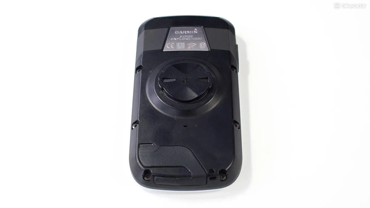
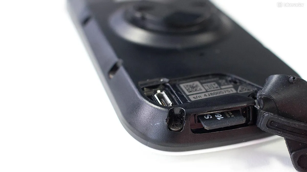
Turn it over and you'll see a custom micro-USB port for charging and transferring data, and recessed within the bottom edge there's a Micro-SD slot for swapping in new maps. Both are protected by rubber covers that keep out rain, dust and muck. Our unit came preloaded with cycling-specific maps for Europe, both on-road and off-road, including lots of waypoints.
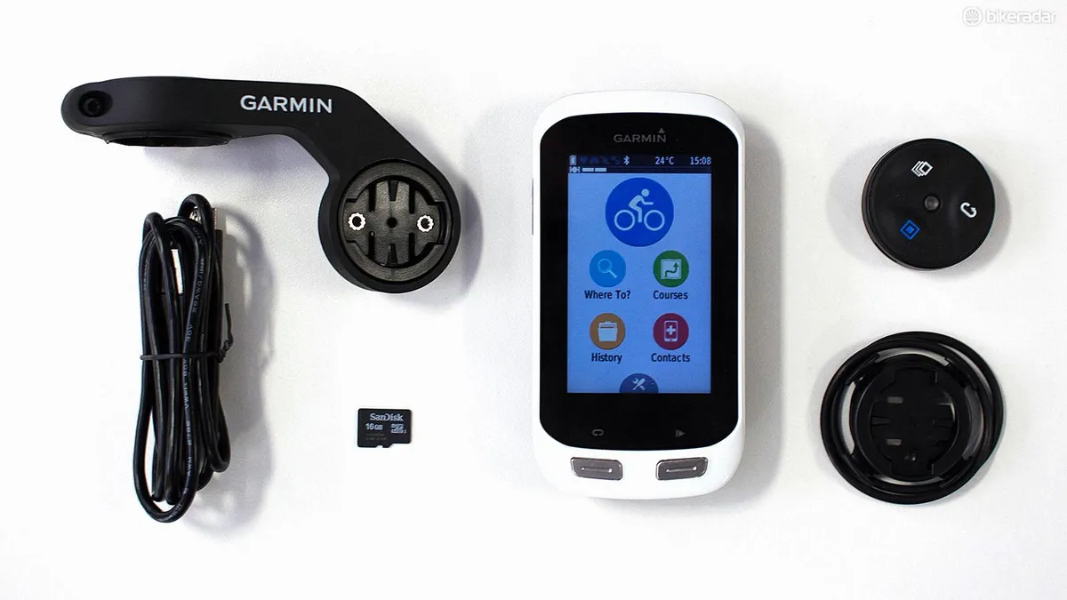
There’s the standard Garmin quarter-turn mount on the back, which most BikeRadar staffers now have total faith in. It’s a simple, secure system for mounting your bike computer, either on your stem/bars, or with the out-front mount provided. The latter does make your cockpit look like mission control, and some might feel it spoils the clean lines of your handlebars, but it’s a much easier position for stealing quick glances when you’re barrelling along.
Garmin Edge Explore 1000 navigation
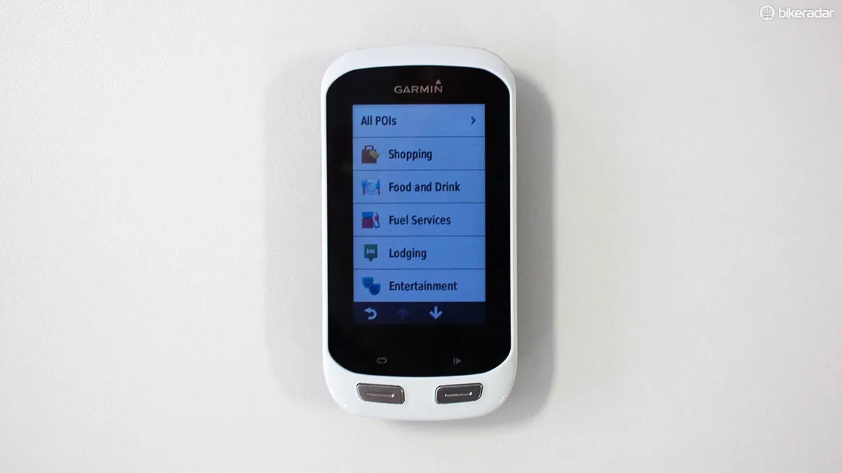
First thing to note is that the cycling-specific maps it comes preloaded with have an impressive range of points of interest: shops, food and drink outlets, petrol stations, hotels, bars and nightclubs, sports venues (‘let’s go ice skating!’), and hospitals. These are clearly pulled from its auto units, and I’d have liked to see the hospital option located higher up (possibly above the ice skating?), but it’s an impressive list nonetheless.
Tap one of them and it’ll present you with a list of the nearest ones, along with their respective distances. Thanks to the dual-mode GPS and GLONASS satellite reception, the Explore 1000 takes mere moments to lock on to your position, and then off you go.
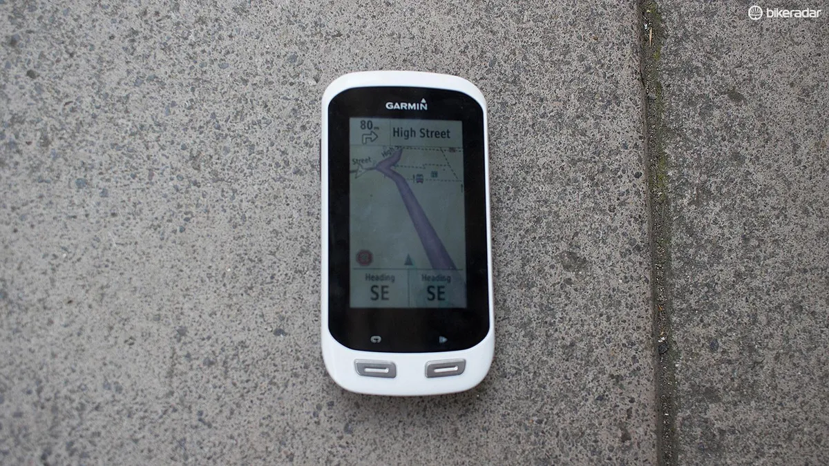
The second thing to note is that this really is akin to using a car sat nav, particularly when you’re using the maps in 3D Mode. This gives you a nice big purple line to follow, which adjusts in real time, rather than the top-down map that you may have used on the Garmin Edge 810. While the latter sounds sensible, I’ve found that it usually tries to display too much information, and suffers from information overload.
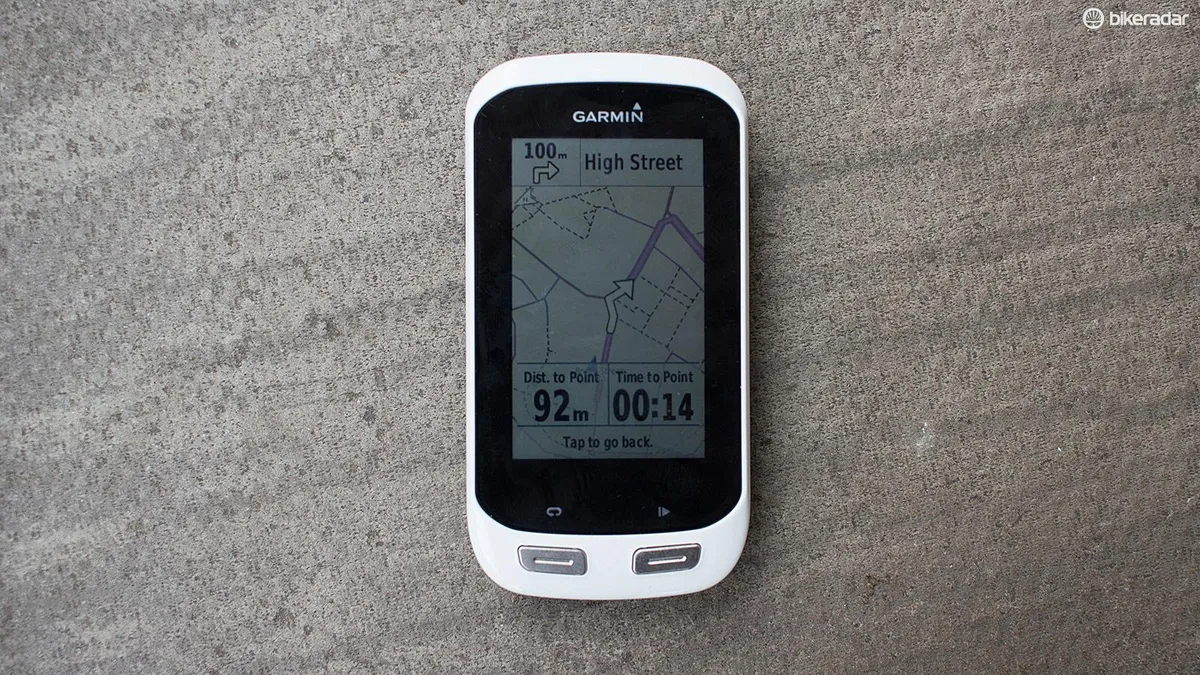
This purple-themed 3D map, by contrast, is wonderfully clean and intuitive. I particularly like the fact it warns you when there’s a turning coming up, beeping and giving you a visual clue when you’re 100m out, with a close-up of the turn you have to make, along with the time and destination until you get there. Also similar to a car sat-nav, the Edge 1000 will recalculate if you decide to divert from the chosen course.
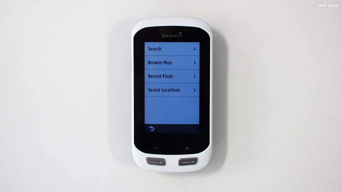
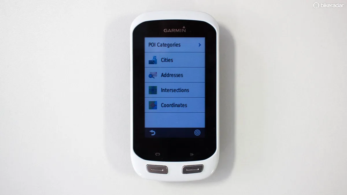
If you want to enter a postcode rather than head to the ice rink, you can do that. If you want to search for a street name within a city, you can do that. If you want to browse the map, zoom in and out, then drop a pin with your finger where you want to go, you can do that. If you want to enter the GPS coordinates, yup you can do that. So it’s very easy to tell it where you want to go, and I found this worked well in practice.
You can also upload a GPX file of someone else's ride and follow that, turn for turn. Speaking of which, you don’t have to be locked onto the map screen to navigate – you can keep it on the data screens to track your speed etc, and turn-by-turn directions will appear when you’re approaching a junction. Handy.
If you do miss that turn, it will also recalculate your route for you – rather than stubbornly refusing to provide guidance until you’ve returned to the GPX route uploaded, as the Edge 810 has an annoying habit of doing (‘return to start!’).
Garmin Edge Explore 1000 features
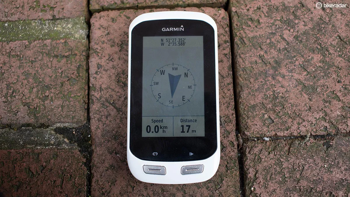
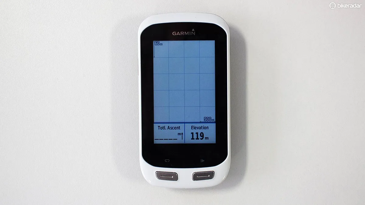
So apart from navigation, what else can it do? Well it can display three pages of custom ride data, covering all the usual things like current ride speed (including current/max/average etc), distance, time, elevation and ascent. It also has limited ANT+ support for heart-rate monitors, power meters, Garmin’s Varia range of ‘smart’ cycling devices, speed and cadence sensors. Swipe right past the three custom data fields and you also get the Map, Compass and Elevation pages.
I particularly liked the fact you can simply press and hold one of these data fields to change it for something different – this is much easier and more intuitive to use than the deep-menu method used by other models. This is a good sign that some of the intuitive user experiences we all take for granted in a post-iPhone world are gradually being adopted.
The smartphone notifications worked pretty well, I found – I’m not massively keen on getting call/text alerts when I’m out riding, so I’d probably disable that feature, but I’d definitely keep my smartphone connected via Bluetooth anyway. That’s because I love the Live Tracking feature that tells loved ones in real time where I’m riding, and the weather alerts are pretty handy too. Plus the auto-uploads mean I can share rides on Garmin Connect – and then to Strava – without having to physically connect it to my computer after every ride.
Bluetooth connections are made by opening the Garmin Connect app on your smartphone, and I found it to be more reliable than my older Edge 810. The devices would recognise each other immediately, start chatting and syncing would commence. Easy. You can also auto-upload via WiFi if you prefer.
You’ll also need to keep the two connected (and the Garmin Connect app running) if you want to use the Incident Detection feature that makes its debut on this model. It works via an accelerometer, which detects when your bike makes a sudden, forceful fall to the ground and will give you 30 seconds to switch off the shrieking alarm before texting or emailing your nominated emergency contact with your location.
So how well does it work? Well we didn’t undergo a series of traumatic crashes to test its efficacy, sorry, but we did put it through a series of simulated crashes to see how it responded. Dropping the unit onto the ground with its rubber shock sleeve fitted failed to set it off; giving it a vigorous shake occasionally managed to do so. Garmin says that it will take into account the speed you were travelling at, which may explain why we couldn’t consistently fool it. We’ll update this review if/when we suffer a serious calamity.
Garmin Edge Explore 1000 battery life
The Explore 1000 promises up to 15 hours of battery life – but that’s without using GLONASS satellite reception, or Bluetooth, or WiFi, or ANT+. So no speedy location finding, no Incident Detection, no auto-uploads, heart-rate or power meter data. Start using these features and it will fall fast. We got around five to six hours of riding time out of our test unit with GLONASS enabled, plus heart-rate data and a Bluetooth connection.
Given that this bike computer is designed for people who want to ride in unfamiliar places all day, that’s a little less than we’d really expect for such an expensive device. You could switch off GLONASS and get another hour or two, and if you’re touring then you’ll probably forego heart-rate and power meter data anyway, but we still think it’s a shame that you can’t use the full feature set for a whole day’s riding.
The Edge 810 will merrily keep working through a full eight-hour day on the bike without complaint, its features firing on all cylinders, but then you don’t get the detailed navigation that the Explore 1000 provides. You pay your money, you take your choice.
Garmin Edge Explore 1000 price
So now we come to perhaps the hardest pill to swallow – it costs £389 / $449. That’s around £50 / $50 cheaper than the full-fat Garmin Edge 1000, which comes with loads of extra features and was described as our US editor-in-chief Ben Delaney as “the definitive GPS training and touring bike computer”.
And it’s £140 / $140 more expensive than the Garmin Edge Touring Plus, which also features ‘Create a route’, route recalculation, and heart-rate monitor support. But this lower model (and the Garmin Edge Touring) doesn’t feature smooth 3D maps for navigating, and we think that’s the killer feature of the Explore 1000.
Garmin Edge Explore 1000 vs Garmin Edge 1000 vs Garmin Edge Touring Plus
So what's different between the Explore 1000 and its more expensive sibling, the Edge 1000? Well there's less emphasis on wringing the best from your body. Gone are Strava Live Segments, banished is the Virtual Partner, AWOL are the Advanced Workouts. But it does feature an accelerometer for Incident Detection, and it can be a head unit for your e-bike – both features lacking from the Edge 1000.
If performance data is a priority, you’ll probably want the Edge 1000, which has up to five pages of custom ride data, training features, plus all the clever navigation we’ve already described. To me, this looks like a better deal at just £50 / $50 more.
Or if you're happy to ditch the phone alerts and incident detection, take a look further down the range at models like the Touring and Touring Plus. These are based on the Edge 810 model, and again deliver a simplified user experience for riders who are less focused on performance. But given how good smartphones have become, I find the mid-ride navigation much less satisfying, the maps clunkier and the whole experience a bit dated.
Garmin Edge Explore 1000 bottom line
Bike computers have come a long, long way. The feature list of the Garmin Edge Explore 1000 reads like something out of a sci-fi novel for any cyclist from 20 years ago. And this is a genuinely good unit, which does what it sets out to do well – it helps you navigate from point A to point B with clear, effective mapping, just like a car sat-nav would.
It can suggest new routes for any distance you want, or find you a point-of-interest like a hospital or café. But while the GPS + GLONASS satellite reception means it fixes onto your location incredibly quickly – usually in a few seconds – it takes much longer to calculate routes. We found it can take up to five minutes to suggest three cycling-friendly 70km routes.
The battery life is lower than we’d expect for this kind of money, if we’re honest: five hours of riding might be plenty for some, but I often ride longer than that when I’m touring, and I don’t want to switch off features to avoid running out of juice. It’s much better than you could expect from a smartphone, though.
In summary, if you’re anything like me, the superior navigation of the Explore 1000 probably places it near the top of your buying list. It’s not perfect, and there are some other very good options out there, but it fits very nicely into the type of riding I want to do.
