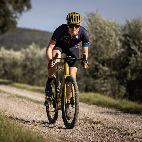
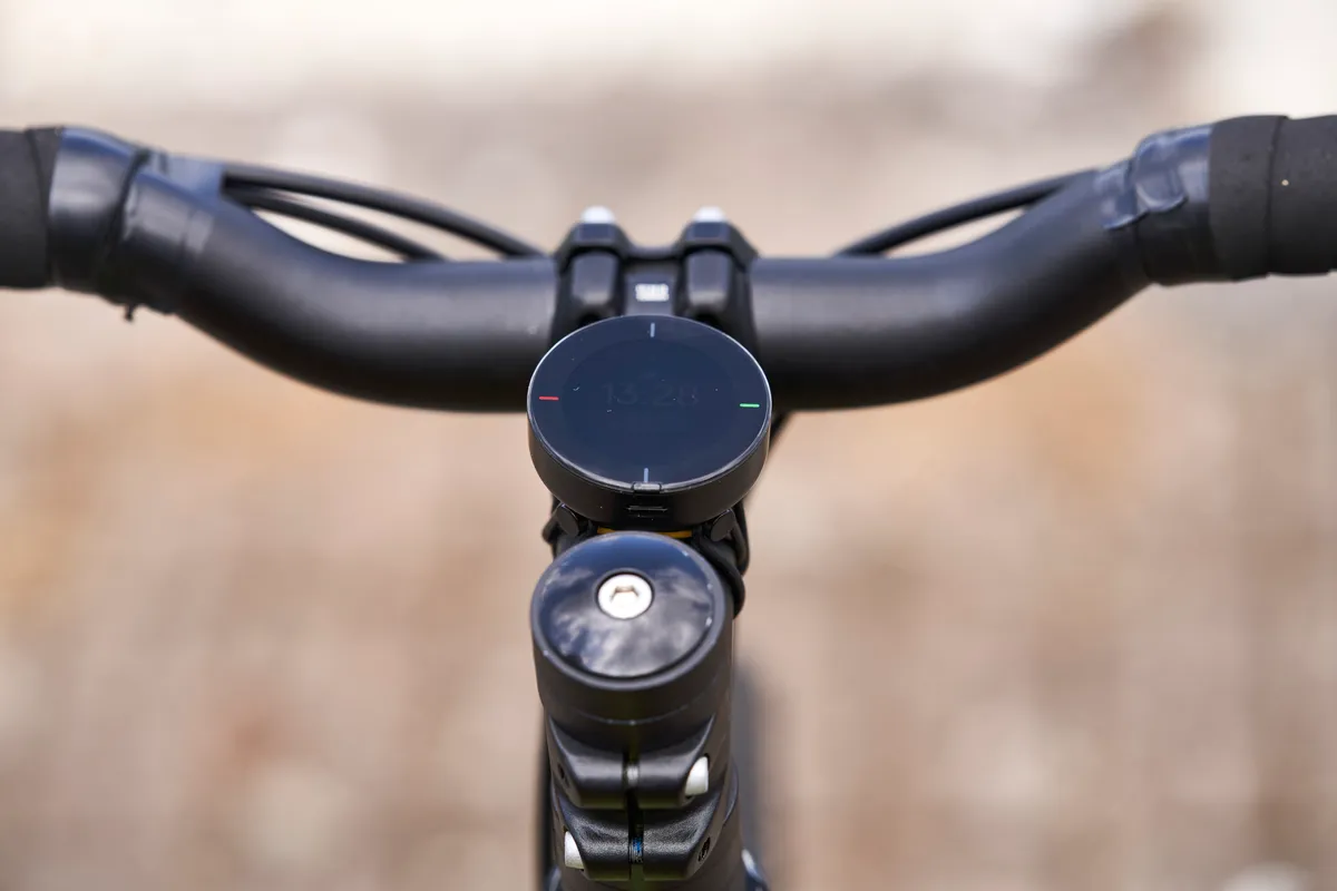
Beeline’s Velo 2 represents a significant update over its original Velo computer, and now features an LCD screen with rocker buttons and a larger display.
Its competitive price point of £79.99 / €89.99 / $99 positions it as one of the cheapest bike computers on the market.
With it, Beeline packs some impressive technology into the unit and considering the low price, it gives you some of the functionality of more expensive computers.
However, there are significant improvements to be made in many areas before I can recommend it, particularly concerning its mapping software.
Beeline Velo 2 mapping and specifications

The original Velo initially relied on ‘as-the-crow-flies’ navigation. It was later updated to offer a compass mode and turn-by-turn navigation.
The Velo 2 offers a decidedly more typical approach to navigation.
Once you have paired the Velo 2 with the Beeline app (available for iOS and Android), you can decide to either be routed to a specific destination or ride a route with various waypoints.
The device uses Bluetooth LE 4.0 connectivity to avoid draining your phone’s battery life.
Once a destination has been inputted, the app will suggest three routes – a fast route, a quiet route, or a balance of the two.
If you don’t want to stick to a pre-set route, you can also use a compass mode. This will display an arrow with the general direction you should be heading in.
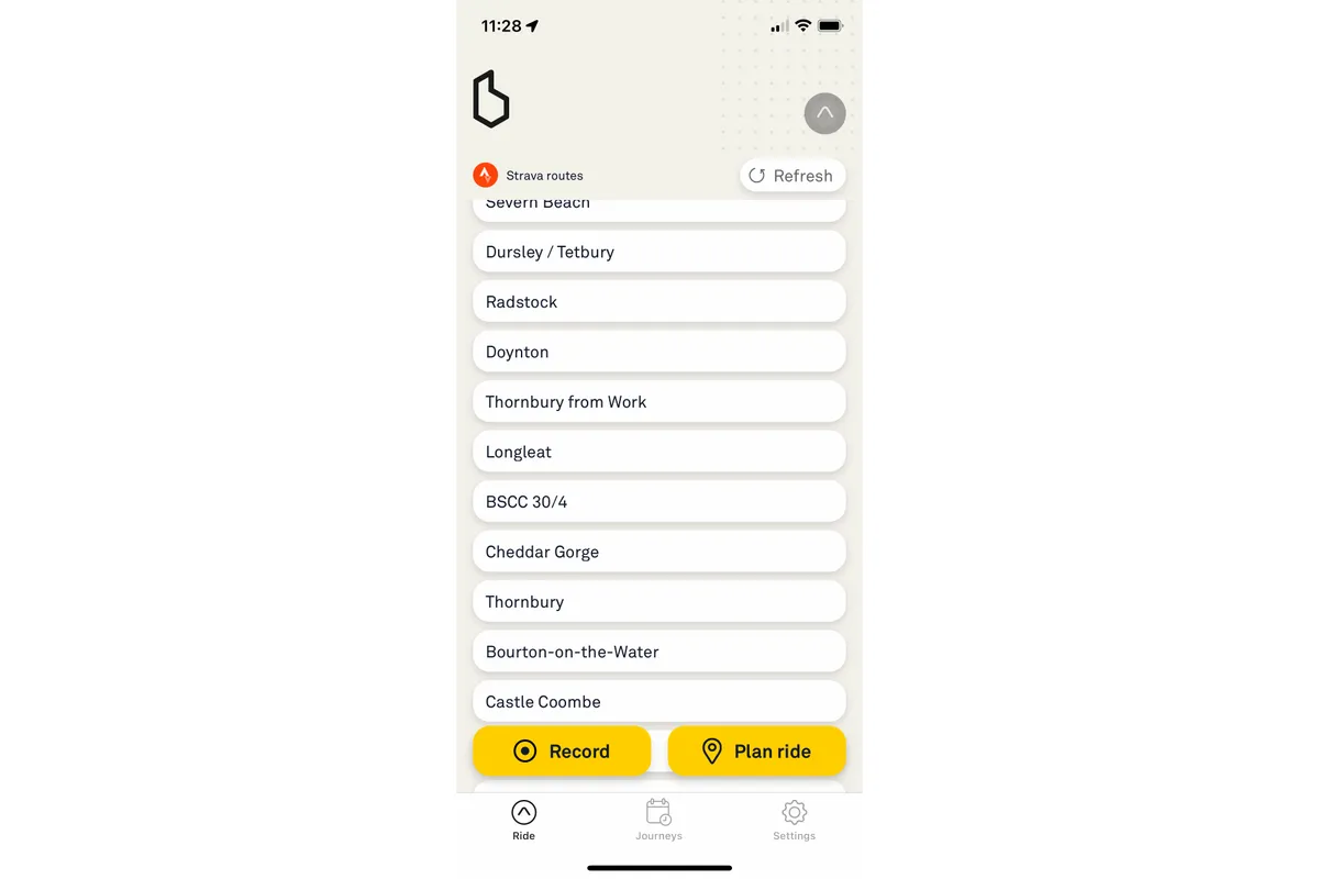
Strava routes can also be accessed via the Beeline app if you’d prefer to create a route there and use the device for navigation.
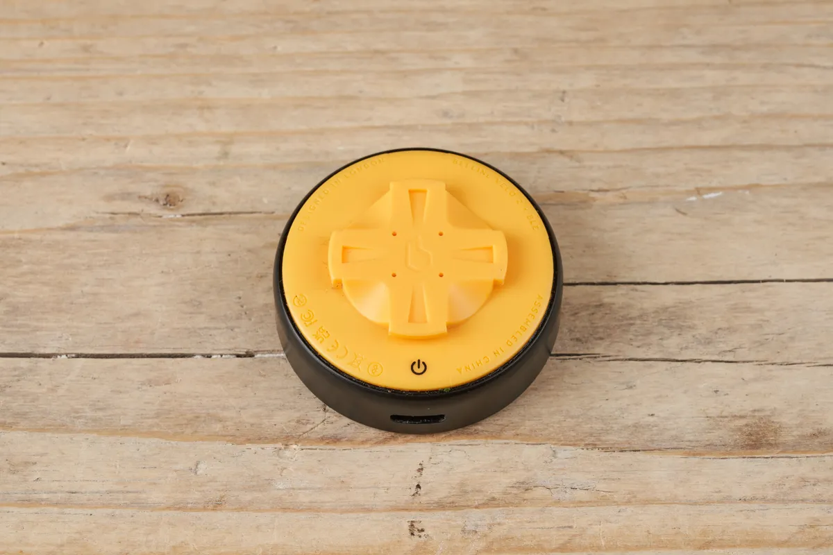
Beeline says it has focused its mapping efforts on the road and cycle paths, and that the mapping isn’t fully off-road optimised yet. As a result, the unit was tested solely on roads and cycle paths.
The Velo 2 is claimed to quickly re-route you without relying on your phone’s GPS if you veer off course.
It also tells you your stats such as speed, arrival time, average speed, time remaining, distance to go, clock, and time and distance. Beeline says the average speed function uses auto-pause by default.
The British brand claims the device has an 11-hour battery life and it charges via a USB-C port. It claims the Velo 2 will charge to 30 per cent from empty in 20 minutes, which I found to be accurate.
The Velo 2 weighs 23g.
Road ratings

Beeline has introduced ‘Beeline Road Ratings’ on the Velo 2, as a means of continually suggesting optimal routes.
There are green and red buttons on either side of the device. If you enjoy a particular section of a route, you can tap the green button while riding, which will register with Beeline via its routing algorithm.
Conversely, if you ride an unfavourable section, you can press red and that’ll also register.
Beeline says it can then analyse arising trends from these ratings and, ultimately, improve its mapping algorithm to suggest more suitable routes.
You’ll want to be careful if you take your role as a data source seriously, though, as the right-hand button to positively rate a section is also used to pause the ride.
As a smaller company, Beeline says its navigation will grow stronger as more users contribute with their feedback from the device.
Mounting
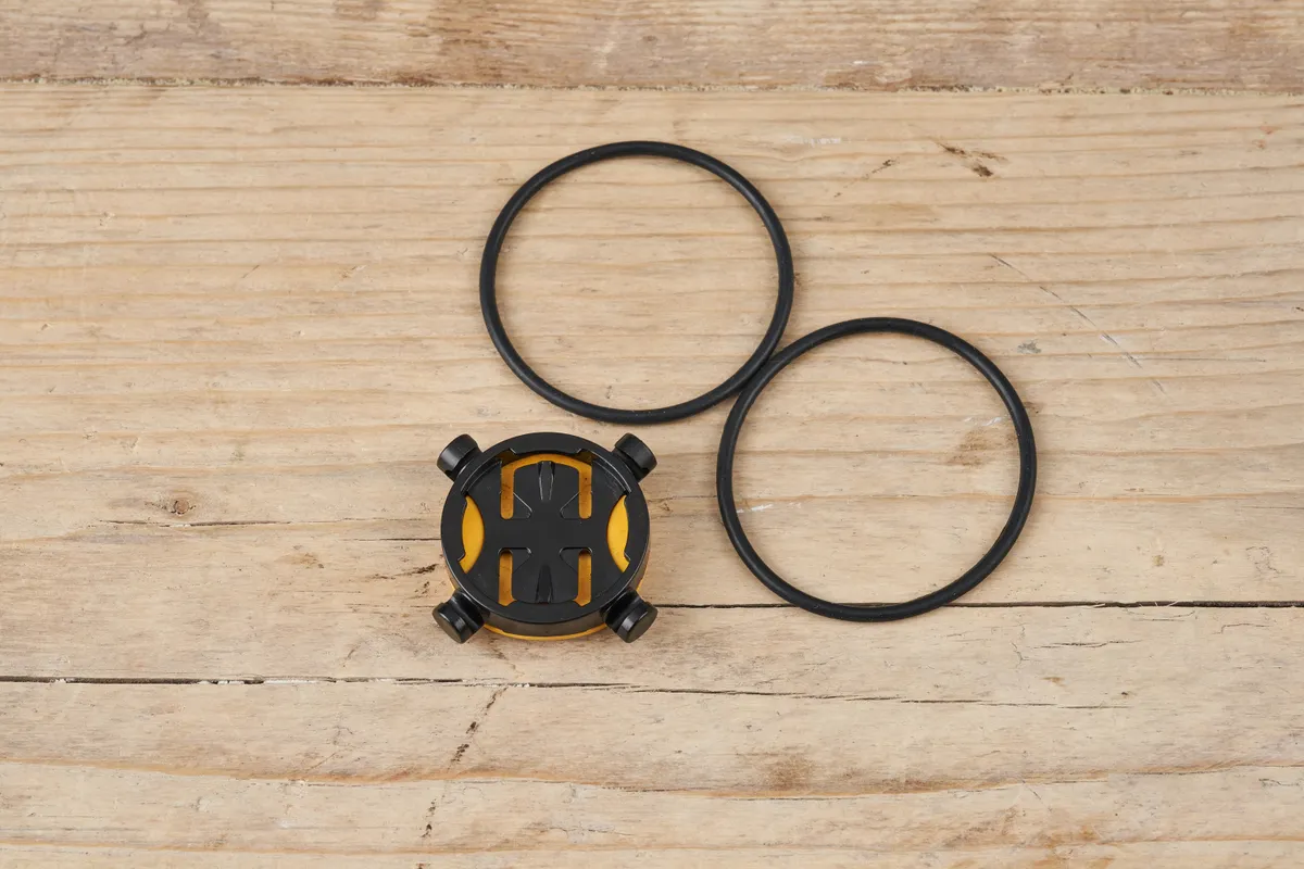
The Velo 2 fits Beeline's own specific quarter-turn mount that is similar in style to that found on Garmin bike computers’s (but not compatible). Two sizes of silicone mounting bands are included in the box to suit different handlebar sizes, or you can mount the computer on the stem, as I have done.
It doesn’t matter which way round you install the mount because the device will fit into it regardless of its orientation.
The mount is excellent and it may be a small detail, but I liked the silicone bands it uses – I found they require far less force to cinch the mount down compared to a Garmin.
The Beeline app

The Beeline app is relatively intuitive to use and laid out clearly. There is a page for your Beeline favourite destinations, saved routes and Strava routes.
I didn’t like having to start my ride by going through the Beeline app. I’d much rather turn my bike computer on and press ‘Start’, and I forgot this frequently early in testing.
Beeline Velo 2 performance
The Velo 2 was tested around the south east and west of England.
I tested it on commutes into Bristol’s city centre, as well as some unfamiliar countryside rides in the surrounding Cotswold and Mendip hills. I also used it to navigate to different waypoints in Bristol that I was unfamiliar with, using its fast, balanced and quiet routing options.
The device was also tested on familiar home-turf routes in Berkshire and the Chiltern hills.

I tested the Velo 2 using Beeline’s own mapping software for the commutes and destination testing in Bristol. I then followed Strava routes for my training rides.
For cycling to work in Bristol city centre, the Velo 2 generally suggested suitable fast, balanced and quiet routes.
Its balanced and quiet routes were similar to my preferred route along the Bath to Bristol cycle path and its fast route offered a more economical road-based alternative.
Early into testing, some of the routes sent me down some narrow and twisty alleyways, but after rating them negatively on the device, the app then suggested more suitable routes.

The device offers turn-by-turn navigation when en-route and I liked that it tells you exactly how far you have until the next direction cue.
The navigation prompts aren’t the easiest to follow and it can lose its way sometimes. There were a few instances where the device suggested turning onto paths or roads that didn’t exist.
I also found its navigation wasn’t the clearest on large roundabouts or junctions with an unconventional structure. If a roundabout features on the route, the Velo 2 will display a broken circle with a number in the middle of the circle. The number signifies the exit you need to take.
Unfortunately, the exit numbers displayed were often completely inaccurate. A ride into the Berkshire countryside saw me approach a small mini-roundabout with four possible exits. My route would have me taking the third exit, but the device suggested a non-existent fifth.
If you’re approaching a fork in the road, the Velo 2 will also display a graphic to let you know this is the case and which exit to take. Unfortunately, again, I found it regularly missed these.

The navigation struggled in the countryside, too. A club ride featured a 10km section through quaint Oxfordshire lanes with a smattering of turns at junctions. The device didn’t recognise these at all, suggesting I had 10km until the next turn.
That said, because I was familiar with the route, I knew this wasn’t the case and when looking at the routing graphic, the device did take into account the turns but just didn’t signpost them.
I’d also prefer it if the device showed more of the surrounding roads on the screen rather than merely highlighting the route you're taking. This would make negotiating large roundabouts or junctions easier, because the surrounding roads give useful contextual information, especially if the number of exits is incorrect.
I’d also like to see elevation stats built into the device – it would be useful to know what elevation you are currently at so you know how far you have to go to the top of a climb.
Problematic on longer rides
On all of the rides I tested the Velo 2 that were over 50 miles, the device would stop recording the ride part-way around the course.
Having followed a pre-determined route, the device would stop recording mid-ride and revert back to the home screen.
Because I was riding with a group on each occasion, I couldn’t stop to see what caused the issue, but when I opened the Beeline app, I could see the ride paused just before I had noticed the device had stopped recording on the home screen, so I could save the early sections of these rides.
Beeline’s view
I contacted Beeline after my initial testing to discuss the navigation problems I was experiencing.
Tom Putnam, one of the co-founders of the company, explained I was likely experiencing these issues because I was predominantly using Strava routes.
Putnam explained Beeline “uses a third party service (Mapbox) to match the GPX file to the map and return manoeuvres. We’re aware that this can return some strange info such as missed manoeuvres, ‘phantom’ roads (often small paths that Mapbox has marked as cyclable) or odd numbers at roundabouts.
"For most of our users, this is a secondary way of using the device – most are using it by planning routes in the app, so this is where we’ve focused."
Putnam also says only 0.6 per cent of its users use Strava routes with its device.
He further explained that even Beeline’s mapping software isn’t infallible to routing errors, but it is able to make updates to the software if users report any routing errors.
With regards to the device stopping recording part-way through 50 mile-plus rides, Putnam said dropping Bluetooth connections might be the cause, with the device automatically reverting to the home screen.
However, he said all would not be lost, because the phone will still be recording the ride. As soon as you reconnect (which can require foregrounding the app again), “it should seamlessly pick up where it left off”.
This is a plausible explanation as to why I was experiencing these issues. However, at the end of these rides, I found that my phone hadn’t recorded the rest of the ride, although I hadn’t retrospectively restarted the app.
Finally, as for the mapping clarity, Putnam explained Beeline has “intentionally tried to keep the interface really simple, hence the ‘stubs’ for other roads rather than showing the entire surrounding map”.
Putnam added the brand is aiming for a balance between showing enough detail when navigating but to also keeping it “as clean and glanceable as possible” and that it has received “great feedback on this” from its users.
Beeline urged me to test the device on my training rides using its own mapping software.
Buttons and battery life

The buttons are simple to use and a clever move for Beeline to take, rather than trying to use a touchscreen.
Straightaway, however, turning on the device can be difficult. Beeline says “you need to hold the power button for 3 seconds to switch it on” and it has “no plans to decrease the time here as it would then risk accidentally being turned on in pockets / bags etc…”. I found the ‘on’ button didn’t always react, despite following these instructions and it could take a few attempts to turn it on.
I also don’t like that, if you pause a ride or leave the device on when completing a ride, the device screen goes to sleep. If you forget, then you may come back to find the device has drained itself of power.
Beeline says this shouldn’t happen and that the “difference between standby and ‘off’ is fairly minimal. The device will last a very long time if not being used”.
Unfortunately, I didn’t find this to be the case. I’d prefer it if the screen stayed on, to act as a visual prompt for you to turn it off, or if you could manually select it to go to sleep or power off.

While I found the claimed 11-hour battery life on my device to be accurate, later into testing, whenever the battery life reached 30 per cent, the device would quickly drop into single digits and die within about half an hour.
Beeline said “this sounds like quite an extreme drop but we don't think it is a sign of a problem with the battery itself, rather the estimation of remaining charge”. To rectify this, the brand says it “is adding in battery logging analytics so we’ll get feedback on the reading accuracy so we can calibrate / adjust in software accordingly”.
While I haven’t had any problems with the device in terms of hardware, the build quality feels rather plasticky, compared to the more solid and substantial construction of other computers, such as a Garmin device.
Beeline Velo 2 further testing
Following Beeline’s feedback, I tested the device on a handful of rides on courses created using the Beeline app.
To Beeline’s credit, the mapping performance was considerably improved and there were fewer instances of the device sending me down phantom roads.
I found it still suffered with not picking up forks in the road and struggled on unconventional road or junction layouts.

Additionally, Beeline’s app limits you to only 23 waypoints.
On all of my rides over 30 to 40 miles, it wasn’t possible to create the full route using Beeline’s app. I had to resort to setting the last waypoint as a familiar location so I could then ride the rest of the way home unaided.
This was despite attempting to manipulate the waypoints to try to extend them further into the ride, without the app diverting from the route I intended.
I also found the mapping function cumbersome to use and when trying to extend waypoints, the widget used to control it was often unresponsive despite holding down or tapping it.

In short, the Beeline app requires some work before it's able to rival established platforms such as Strava, Garmin Connect or Komoot for ease of use.
After consulting Beeline again, I discovered the 23-waypoint limit has been implemented because this is Mapbox’s limit and the brand wanted routes to work on either platform.
However, Beeline said I was not the first person to ask for a bigger limit and suggested it will work on revisions sooner rather than later.
On the subject of creating a course, Beeline acknowledged “it can be a bit fiddly” and it is “looking at ways to improve the route adjustment and waypoint setting as part of a wider review of the journey planner”.
As things stand, I’d find it hard to live with the device if I had to plan all of my rides using Beeline’s app (given the limitations of third-party mapping). Having 23 waypoints would certainly hinder the total distances I could ride, if I wanted to use navigation.
What are the Beeline Velo 2’s competitors?
At £79.99, the Beeline Velo 2 is one of the cheapest, non-wired cycling computers on the market.
Garmin’s entry-level 130 Plus is over twice the price at £169.99 and Wahoo’s Elemnt Bolt costs £264.99.
The Lezyne Macro Easy GPS retails for £80, and is designed for riders who want to record their ride and view their statistics afterwards. It doesn’t rely on a phone app and has a page with breadcrumb-trail style mapping. Unlike the Beeline Velo 2, it can even connect to Bluetooth-compatible heart rate and/or speed or cadence sensors.
The Bryton Rider 320 E retails for £74.99 and is said to support up to 72 functions. The brand claims a whopping 35-hour battery life and, unlike the Velo 2, you can customise the data screens via Bryton’s app. It can also connect to Bluetooth-compatible sensors and features an in-built barometer for elevation statistics.
Beeline Velo 2 bottom line
At £79.99, the Velo 2 represents a cheaper price point than most of its competitors. It has its quirks, though, but it should only get better with time as Beeline rolls out updates.
At the moment, the device is hit-and-miss with its navigation. Regardless of the cost, the key thing a bike computer needs to achieve is to route its user around a loop or to a destination trouble-free and the Velo 2 doesn’t yet achieve that comprehensively.
The prospect of the routes improving is promising and, hopefully, the experience of using the Velo 2 will improve with it.
If you’re heading out on rides longer than 30 miles and require navigation, the Velo 2 wouldn’t be my first pick, especially with the limit of 23 waypoints.
The Velo 2 is a great concept, and it offers something different and refreshing in the bicycle computer market, but there’s a long way to go before it can compete against the best cycling computers.
With its flaws remedied, it would be best for commuters who want to get from A to B and perhaps head out on the occasional short loop. However, for riders who want a unit that can handle both commuting and longer training rides, you are best saving up and investing in a more substantial cycling computer.
Product
| Brand | Beeline |
| Price | €89.99, £79.99, $99.00 |
| Weight | 23g |
Features
| Strava live segments | no |
| Rechargeable battery | yes |
| Turn by turn navigation | yes |
| Connectivity | bluetooth |
| Features | Accelerometer Gyroscope Magnetometer Ambient light sensor for automatic brightness adjustment 4x physical ‘RockerTop’ buttons Weather sealed, water and dust resistant |
| Dimensions | 46.4 mm (1.82 inches) diameter, 17.3mm (0.68 inches) deep |
| Battery life | 11 hours (claimed) |
| Display resolution | 240 x 240 px (266 PPI) |
